Colour psychology has been very fundamental in textile design and affects consumer emotions, perceptions, and purchasing decisions. Designers who understand how colours impact human psychology can create powerful textiles that speak to their audience. This blog helps us understand colour psychology in textile design.
Colours as Emotional Messages
Every colour brings with it a distinct emotion or message:
- Red provokes passion, energy, and excitement. It promotes appetite and elevates heartbeats, thus suitable for active textiles.
- Blue produces a soothing, trustful, and peaceful feeling. It is applied to home furniture to create a soothing atmosphere.
- Green signifies nature, wellness, and serenity, making it suitable for green or organic textile lines.
- Yellow represents happiness and optimism. Though it is a vibrant colour, designers should use it in moderation to not overpower the design.
Cultural Significance
Different cultures attribute varied meanings to colours. For example, while Western cultures see white as purity, some Eastern cultures associate it with mourning. It is through understanding the different cultures that designers pick colours and avoid those collections having a negative connotation before a target audience.
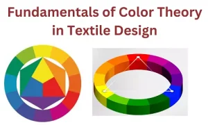
Colour Combinations and Harmony
The colour wheel aids the designer in finding harmonious combinations:
- Complementary Colours opposite on the wheel are contrasting: blue and orange, which adds vibrancy
- Analogous colours side-by-side on the wheel add subtlety and harmony: blue, green, and teal.
- Triadic colours equally distanced on the wheel add shock value and make designs appeal to a broad cross-section of viewers: red, yellow, and blue.
Applying Colour Psychology in Textile Design
Understanding the Target Audience
A designer should choose a colour based on his or her target audience. Young consumers tend to show more appreciation for bright, robust colours that symbolise energy and creativity. On the other hand, mature-age consumers respond positively to smoother, more muted shades that give off a sense of class and relaxation.
Aligning with Seasonal Trends
Colour trends change with the seasons. Designers switch to using warm colours when creating fall collections and cool tones for spring and summer. Being updated on seasonal colour forecasts helps keep the collection current with market expectations.
Impact on Consumer Psychology
Studies show that colours greatly influence a buying decision. Colours that appeal to the eyes will increase brand awareness and increase customer loyalty. Using the appropriate colour to achieve the desired feeling, designers will increase sales and reinforce the brand identity.
Conclusion
Colour psychology can be effectively applied by designers to enhance the aesthetic appeal and marketability of textiles. The designers at Alankaran Designs select palettes that not only beautify spaces but also connect with consumer emotions and preferences. This strategic approach ensures a strong competitive edge in the industry.