The Evolution of Indian Textiles: From Traditional Handlooms to Modern Sustainable Fashion
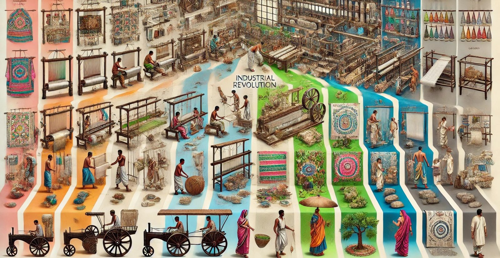
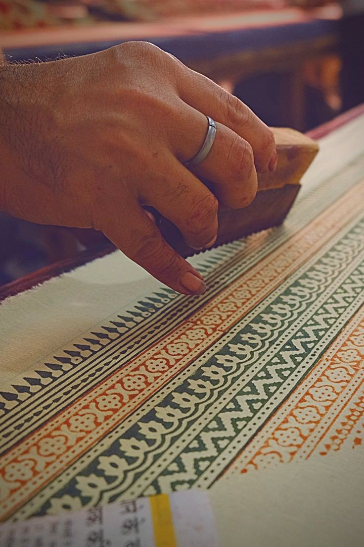
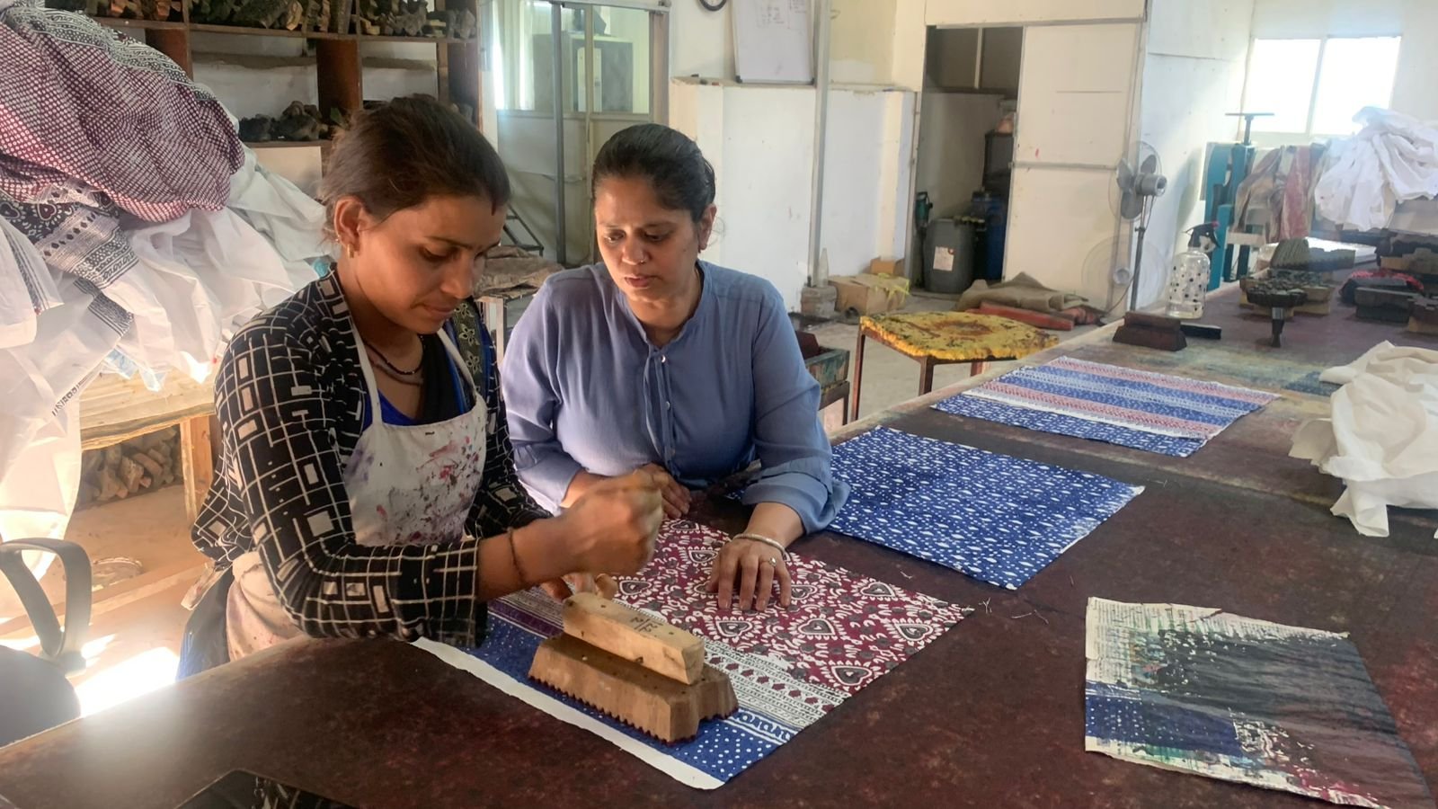
From cultural heritage to technological innovation and shifts in consumer preference, the evolution of textile trends forms a dynamic adaptation story. It is the evolving trend of experiences with the requirements of each epoch—from traditional handicraft to innovations in the contemporary era. Paying tribute to this rich heritage, at Alankaran Designs, we mix these traditions with cutting-edge techniques that define fashion today, (more…)
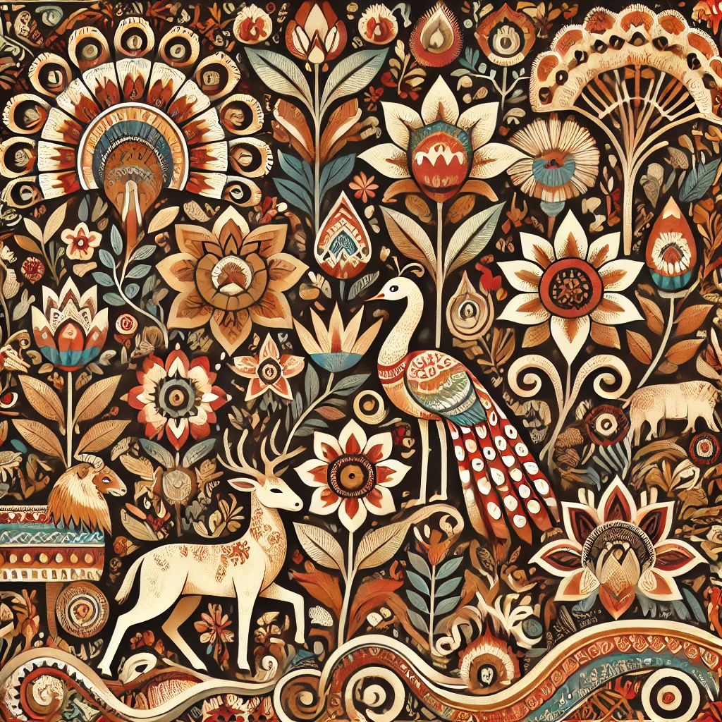
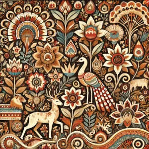
Indian tribal art meets nature—an intricate blend of flora, fauna, and traditional patterns inspired by Warli and Madhubani designs.
Celebrating Nature in Textile Designs
Nature-inspired design, especially flora and fauna, gives beauty to textile design and an appreciation for the environment. Textile designers use botanical motifs and organic forms to create designs and textiles that capture the essence of nature. The blog explains how nature-inspired textile design enhances aesthetics and sustainability with botanical prints and seasonal trends that bring the beauty of flora and fauna into fabrics.
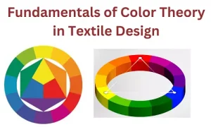
Understanding the fundamentals of color theory in textile design using color wheels for harmonious and impactful palettes.
Colour psychology has been very fundamental in textile design and affects consumer emotions, perceptions, and purchasing decisions. Designers who understand how colours impact human psychology can create powerful textiles that speak to their audience. This blog helps us understand colour psychology in textile design.
Colours as Emotional Messages
Every colour brings with it a distinct emotion or message:
Red provokes passion, energy, and excitement. It promotes appetite and elevates heartbeats, thus suitable for active textiles.
Blue produces a soothing, trustful, and peaceful feeling. It is applied to home furniture to create a soothing atmosphere.
Green signifies nature, wellness, and serenity, making it suitable for green or organic textile lines.
Yellow represents happiness and optimism. Though it is a vibrant colour, designers should use it in moderation to not overpower the design.


Recent Comments